Nice piece about the Star Wars maps for the upcoming show with Bennett Slater Jan 5th at G1988 Melrose! You can get a look at the whole finished SW trilogy for the first time . . . :)
http://www.slashfilm.com/cool-stuff-the-original-star-wars-trilogy-as-maps-by-andrew-degraff/
Monday, December 31, 2012
Monday, December 17, 2012
Map Madness! Jan 5th, G1988 Melrose!
Getting psyched for the January show with Bennett Slater at Gallery1988 Melrose! Here's a small version of my Empire Strikes Back map. Each character is represented as a colored line, and follows their progress through the entire film. The alternating colored lines represent characters traveling together who have a special bond, sometimes for only a short time like Chewie(brown) and 3PO(yellow) when Chewie is repairing him. Han(navy) and Chewie have a bond, R2(royal blue) when co-piloting for Luke (light blue), R2 and C3PO . . .
All three of the Star Wars movies will be available as full size prints (sorry, no price yet) which are 18.5"x22". Im also doing all three of the first Indiana Jones movies.
Labels:
artists,
fine art,
Gallery Show,
opening,
prints
Friday, November 30, 2012
Thursday, November 22, 2012
North by Northwest Passage Prints for sale 11/22!
Tomorrow - on Black Friday - Gallery1988 will have my "North by Northwest Passage" prints for sale. It's an edition of 50, 16" x 16" for $75, signed and - if I do say so myself - darn pretty. So do little Christmas/Hanukkah shopping for that special Hitchcock fan in your life (or just treat yourself to a little wall candy!).
Wednesday, November 14, 2012
Penn Stater Spots
Here's two new spots for Carole Otypka at the Penn Stater about the effects of texting on the world of english education, and asking whether this is abomination of language or simply a more effective abbreviated direction. I'm firmly on the side of abomination. 2B or not 2B. That s the ?.
Saturday, November 3, 2012
Sketchbooking 3
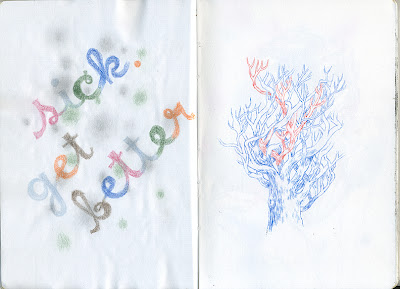
Some of my students have a diptych project to do, so I thought I'd start treating these pages more like diptychs. Fun to play with that call and answer dynamic, especially with collage elements from my new beloved Standard American Encyclopedia.
Thursday, November 1, 2012
Sketchbooking 2 - Indoors
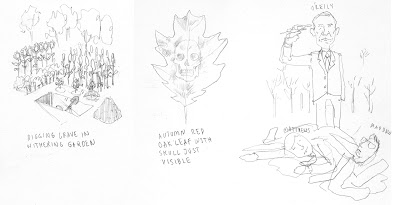
Here's some new sketchbook stuff. I bought some old encyclopedias at Circle Thrift on Frankford in Philly, and I've been collaging them into my sketchbook, and then just seeing where they go. The prints are great - they have that great black and white weathered xerox look on nice slightly yellowed paper. It's been a nice end of the day art activity. More to come!
Sunday, October 28, 2012
Sketchbooking
Did a little drawing down at the Urban Outfitters/Anthropologie Campus in the Philly Navy Yard, and out at Terrain at Styer's. One of these days I'm going to spend a day down at the Navy Yard drawing. It's pretty incredible - the boats, the ferry terminals, the docks - I dig it. I did the aircraft carrier first, and then pre-prepped the gouache on the drive out to Terrain.
Thursday, October 25, 2012
An Illo for The Observer for one of my favorite writers, Shalom Auslander
Tuesday, October 23, 2012
In Class Demo
Here's a little gouache in class demo I didn't get to finish in class - I'm still trying to figure out how to a finish in an hour. I'm just going to walk through the process a bit.
Here's the finished piece.
Hour 1: Working thin, and not using the full opacity of the gouache, I'm laying some basic warms and cools, focusing a bit more in the cools in the shadows. Im basically laying on some color and then subtracting out to maintain a little bit of a value structure. In all of these color in the face, I have a little bit of a pale coppery blue-green (besides the hair). I want that to be a unifying theme color.
Hour 3: Ok - so I like the warm, but now its too warm - so I bring back my tealy base color: a little darker, in the sky, and bit cooler on the ground. In the sky, I'm painting thick on top, going lighter on the bottom toward the horizon, so I can have a little dusky feel. I subtract out some secondary highlights in the hair, and add some darks in the hair. This is why I love gouache - you can still make some big changes, and blend.
Hour 4: I figure I'll work in a little narrative imagery, and after listening to a podcast about the wizard of Oz, I figure I'll make it about a woman who finds religion after her house is destroyed by a tornado. I add some cools in the hair - same cools as the ground color. I also threw in a white morning glory in her hair. I want to pull the foreground forward, so I added some more warms to the ground, and a few stars in the sky. I also like the pale of her eyes after hour 1, so I brought back the pale blue.
Thursday, October 18, 2012
Analog Arkanoid
 |
| "Analog Arkanoid" 8" x 10", pencil and gouache on watercolor paper |
Wednesday, October 17, 2012
Misaki Kawai
I love Misaki Kawai. I remember when I first saw her work 8 years ago, and had my favorite type of reaction which somewhere between "What the hell?" and "This is genius!" - but I knew I liked it, and I still do. It's one of my favorite people to show students to tell them that as long as their being earnest and applying themselves fully, the work will be great. Kawai bends or discards nearly every academic rule, and yet, it works. Picasso said "It took me four years to paint like Raphael, and a lifetime to paint like a child." Misaki's ahead of the curve.
 |
| I even love her drawing of sweatshirt sizing. |
Friday, October 12, 2012
That's why the Space Program must go on!
I'm a big fan of the space program, and forgot to post this old painting I did of Armstrong in 2009. So here's to you Neil! A belated remembrance for a pretty amazing guy who passed away this summer. Over the past few evenings I've been watching the "When We Left Earth" series from a few years ago - not as good as "For All Mankind", but a decent, if overly glossy, portrait of NASA, which has got me thinking. In college my friends and I had a saying coined by Wes Cox: "That's why the Space Program must go on." Whenever someone would do something innovative or crazy, or innovatively stupid, or ask questions to which there were no answers - why are girls like that? would you die if you jumped off this? etc . . . The answer was a statement - "Well, that's why the space program must go on." It was a statement of faith that if we put some smart guys working on it, we could solve anything. We put a this man on the moon, didn't we?
It's great that we're pursuing unmanned missions to Mars - I mean check out Mars! But the manned program - even considering the danger and the disasters that happened with the shuttle missions - is a worthwhile endeavor. People willing to take the risk. Neil Armstrong was. At some point, we're going to need someone on Mars, and the cost - compared to military budgets, social security - are tiny and the gained knowledge would do what the Apollo missions did - drive the economy for fifty years! I'd pay a .5% "space" sales tax. I'd donate to NASA directly if it was a little easier (to do so now seems very complicated - but I think you can send them a check?). Astrophysicist Neil DeGrasse Tyson has been making an impassioned plea and I agree with him whole heartedly, and I think we need to stop thinking of space as something frivolous. Have smart people figure out incredibly tough problems - and the innovation will flow like Tang!
Saturday, October 6, 2012
The Last Policeman
Wednesday, October 3, 2012
Aquariums
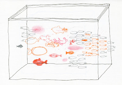
Here's a little sketchbook project I've been fooling around with for the last few weeks. I feel like I've been a bit lost - pursuing things more technically than artistically . . . ? Anyway, I thought I'd try to mess around with something a little abstract. So - I love aquariums. And that love has led to the death of many fish. But I thought it was an interesting problem - an ever changing rectangle of shapes. So here's the beginning of a little side projects. I present to you - AQUARIUMS!!
Subscribe to:
Comments (Atom)


