Tuesday, February 28, 2012

Big in Taiwan!

Angeline Chen from COOL Magazine, a street fashion, art and design magazine in Taipei, Taiwan was nice enough to contact me a few months ago and tap me for an interview in her column.   The magazine sells in Taiwan and also a few places in China, which is pretty amazing.  I've broken through to the mainland!  It was really great to get them in print a few days ago - and interesting to see my work in the midst of Taiwan street culture.  Makes me realize how pop-y my stuff is - and at least for me, how far my palettes have come from 5 years ago.   


Friday, February 24, 2012

Acrylic Demo - for Valentine's Day!!

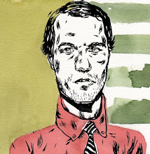
Here's a demo I did a few weeks ago that I just touched up to bring it to a bit of finish - maybe not totally finished - but hey!  I got a Bill Cosby piece to paint, so here it is :).  I wanted to show my class some simple color blocking and dry brush technique. so the steps went like this:
1. Mount a sheet of 140 lb Arches Cold Press to a wood panel, using PVA, and the trim the excess off the edges.  Let it dry for an hour.
2. Paint in a washy sky-y background, draw portrait on top in very, very light pencil.
3.  Block out the face (the shape of the contour of the face) in red oxide (a nice cheap opaque pigment) with a little payne's grey mixed in to give it a slight variation, being careful of the edges.
4. Block out the hair shape and eyebrows in payne's grey, again being careful of the edges.
5. Start into lighter tones to "pull" out midtone highlights.  Basically, stating to shape out the cheekbones, bridge of the nose, ears, back of the neck, and forehead - using dry brush
6. Move up the the value scale being careful to not just keep mixing in white, but using cadmium yellow, napthol red, and light portrait pink to keep it warming - not just lightening, using dry brush.  So far, I've pretty much just used a #6 Filbert.
7. Use light on the sky as a high point for the highlights - in this case, the slightly whited out light portrait pink for the highlight.
8. Descend down into cooler tones and dark from the red oxide mid level, using payne's grey and dry brush.
9.  Use a bit of a napthol crimson wash on the upper left side of the forehead to allow the right side to pop a bit a more.
10. Wash a bit of brilliant blue into the mouth/chin area.
11. Realize you should have been painting the shirt, tie, and jacket at the same time and add them in.:)
12. Throw in plane for extra depressing affect.
13.  Besides prep and background painting, about two hours - not bad, have a cup of coffee.
14. Happy belated Valentine's Day!!

Here's what the end texture looks like.  Pretty pourous - but you can see how the wash on the left side smooths it out a bit.  I want the right side rough - closer the viewer, and remembering that rough surface come forward, smooth surfaces recede.  And - if you look close, you can see the bad photoshop highlights in the eyes I tossed in before I painted them in the finish above.  eeesh.

Thursday, February 23, 2012

Rumbletoid and LostAtEMinor

My friend and Philadelphia consiglieri Josh Longo is now posting for LostAtEMinor and was very generous in throwing up some of my Freddie Mercury portraits for the New Illustration section.  VIVA FREDDIE!! And thanks, Josh!  But enough about me - let's talk about Josh.  Josh is an industrial designer and teaches at Pratt in the ID studios next door to the Communication Design Dept and sometimes stops by my class on Mondays.  We share bus rides back and forth from Philly to Pratt in Brooklyn - and like schoolgirls on a sleepover, we say we should sleep and then talk the whole time.

     Josh has a pretty amazing CV based mostly on his 3D work in Longoland, but for the past few years he's been doing what most of us illustrators talk about, but never REALLY do - and that's branch out.  He's been developing his 2D work and is doing some amazing stuff.  Not to say that Josh wasn't already great at drawing - he was - but moving from drawing as a preliminary for 3D work, and doing drawing and painting as a finish in and of itself is a really interesting difference.  It's been fascinating to watch.  We have a lot of similar influences and his stuff has inspired a lot of the more recent painting I've been doing and vice-versa, which is a blast.  The way he attacks pieces and compositions reminds that it's supposed to be fun - that the if a piece doesn't have intuition, that it's probably lacking in inspiration, too.  If you haven't already, check out rumbletoid - and check out his sketchbooks.


Monday, February 13, 2012

Here's a piece for Megan Scherer for Cincinnati Magazine about a downtown park revamp.  It was interesting doing a straight overhead and trying to give it some dimension.  I like the board game feel.

Delaware Today


New piece for Kelly Carter at Delaware Today about the life changing ease of having a civil union, while still calling for the ban on gay marriage to be lifted (coming soon I dare hope).  Anywho, I had fun painting this one - sort of a softer feel than usual - and God bless the gays!